Team-BHP
(
https://www.team-bhp.com/forum/)
A brands logo indicates its face and signature. In a letter or word, design or crest, it acts as a visual representation of the objects it is attached to. In the automotive world also, logo design plays a major role in the companys brand identity. Brands go to great lengths to design logos that create an identity that will draw fans towards it even before they see the rest of the vehicle.
From American muscle to European exotics, everyone has a favorite car they would like to own one day. But do you also have a favorite car logo? Here goes my list. Please share your's.:)
1. Alfa Romeo 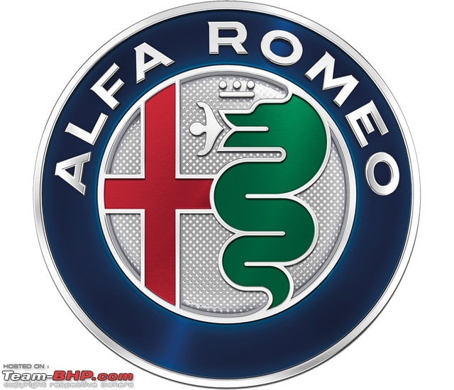
Even a quick glance at the Alfa Romeo logo implies there's a decent story behind it, and you wouldn't be wrong. While the red cross on the left-hand-side is the symbol of Milan, home of the Italian car maker, on the right it appears to have chosen a man-eating snake.
Otone Visconti, a knight from the former ruling family of Milan who fought in the First Crusades, is said to have taken the symbol of a serpent devouring a man from the shield of a Saracen he defeated in battle. Alfa Romeo, however, claims that the man is in fact emerging from the snake, purified and renewed, and the scene is a symbol of rebirth.
2. Ferrari 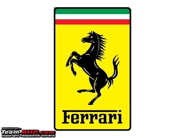
No list of great brand logos is complete without mention of the prancing horse. The image was first seen on the fuselage of famed Italian First World War fighter pilot Francesco Baracca, who may have taken it from his enemys coat of arms. Legend has it that in 1923, brand founder Enzo Ferrari met the pilots mother and father and was convinced that using the same pony painting would bring good luck. The yellow is a throw to Ferraris hometown of Modena, with a touch of the Italian flag above. The unique design of the logo has certainly brought Ferrari immense prosperity merchandise bearing the logo makes up a large portion of the brands profits.
3. BMW 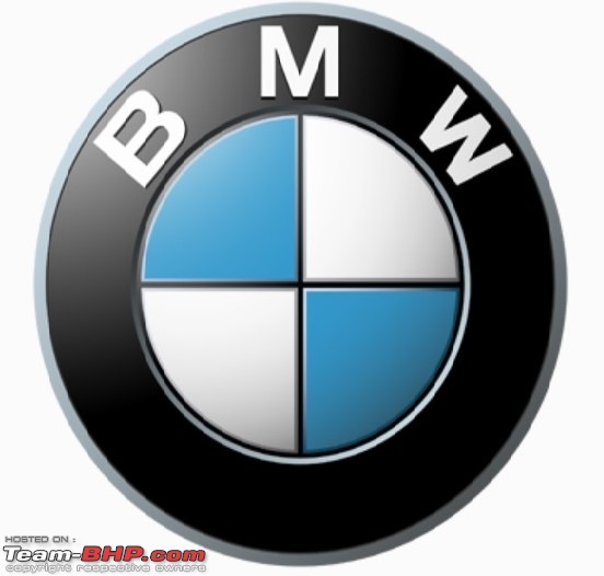
For a long time, the blue and white are often thought to be a spinning propeller, to honor BMW's aircraft-engine beginnings, but the truth is a little different. For BMW, the blue and white colors of the BMW logo symbolized the Bavarian flag colors and represented the companys origin.
The companys home state of Bavaria was also to be represented on the company logo. The quarters of the inner circle on the BMW logo display the state colors of the State of Bavaria white and blue. But they are in the inverse order (at least as far as heraldic rules are concerned, where you read clockwise from the top left). The reason for this inverse order of blue and white in the BMW logo was the local trademark law at the time, which forbade the use of state coats of arms or other symbols of sovereignty on commercial logos.
For me my most favorite car logo has to be undoubtedly the Ferrari logo. The emotion generated just by seeing this logo is unparalleled!
And my second favorite logo is BMW. Not only that it has the legacy of such an amazing history (and this is one of the least changed logos over decades out of most car logos), but the propeller is so enchanting by itself. The propeller stands for all the engineering marvels we appreciate. I love this logo!
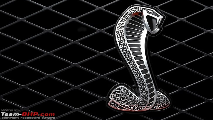
Not a manufacturer logo but the best one that was ever put on a production car IMO. The Shelby Cobra.
 Source
Current Skoda logo is very clean and classy.
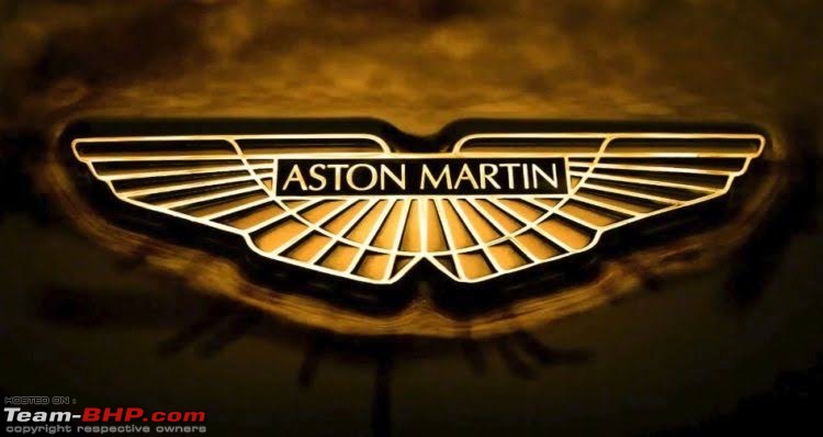
My favourite one is of
Aston Martin. Something very elegant about it.
 Runner-up : RENAULT
 - It looks very simple and doesn’t overdo at all. See how it enhances its Romanian stepbrother’s looks :

However,
TATA would be the worst one for me. Nothing offensive in particular, but if you have the same logo from this :

to this :

..it wouldn’t really look good. :Frustrati
After all, Logos are a very important way to brand your products.
As an Indian, I can proudly say that Tata cars have come a LONG way from the Indica or Sumo to the Altroz and the Harrier, in terms of looks, safety and a niggle free experience, if they were to do something about a new Logo to distinguish their Passenger Vehicles from the CV’s. :thumbs up
- AVIANSH.
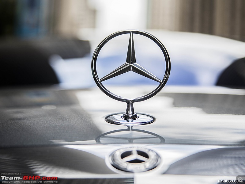
1. Mercedes Benz triple pointed star. Nothing can beat the presence of that logo specially on a sedan, except may be, Rolls Royce.
2. Toyota, Not trying to impress or flashy in any way, just a simple logo probably a bit boring too, but gets the job done, just like Toyota vehicles.
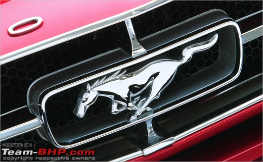
3. Ford. Looks like its something in motion, and its more impressive vis-a-vis its primary historic rival, General Motors.
4. Tall, rectangle PAL logo. Somehow, for me it had a unique charm. Was available on Premier President.
Favorite or not, this logo holds a special place in my heart; if it weren't for this galloping horse, I wouldn't be making this post or wouldn't have obtained a membership in TBhp in first place.
This thread is a great idea! :thumbs up
I could recognise logos of most cars when I was 4. Got the Gran Turismo game with all its car brands a few years later and that number got bigger. Now of course, I know about over a hundred brands from the automotive media I consume.
My favourite logo has always been the three pointed star. One look at it tells you about the level of opulence that it offers. You know that this is a premium/luxury brand.
Similarly, a look at the simple Toyota logo on a Toyota clears all doubt about reliability and resale value. (Also reminds you that you won’t get any discounts rl:)
Truth be told, I never really liked all the busy logos like that of Alfa Romeo and all those hypercars. I like it when automakers keep their logo simple, and when their logo informs you of the car, the brand and their values. Here is one thing that logo designers must keep in mind..
Now with multiple carmaker’s in recent times moving to simpler flat logos, I like them even more. etc.
Even the new VW logo (flat 2D one) IMO is kinda nice.
The
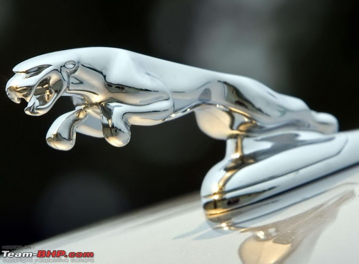
The old Jaguar logo anyone?
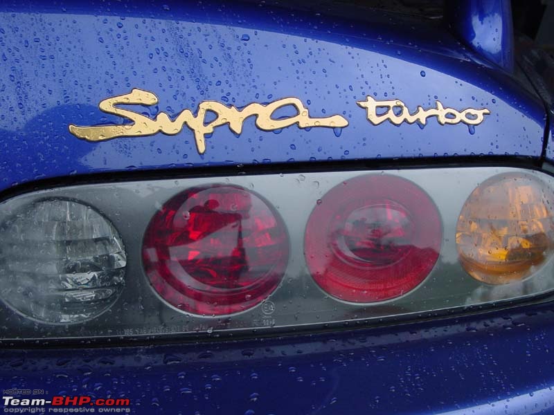
The Supra Turbo logo holds a special place in my heart and I'm so glad that Toyota carried it over to the new Mk V.
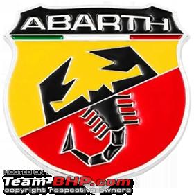
The Abarth logo.
Cheers
Nothing can beat Merc, fits at various places very nicely. Be on a bonnet, boot lid, steering, wallpapers, brochure.
Should be easy, but is a pretty hard thing to say.
1.
Dominating, identifiable, classy, timeless
Though the newer
LARGE ones, especially the lighted variety seems vulgar, nothing can beat this...
The sight to aim on the plebeians using the roads.:p

Though too simple and easy to recreate. Also if you look at it hard for long, everything from the old Chrysler emblem to Mitsubishi to even Maersk comes to your mind. Old Toyota emblems in 70s, 80s Hiaces looked like inverted Merc stars. Also kind of cold and aloof.
2.
Trustworthy, reliable, dependable, familiar 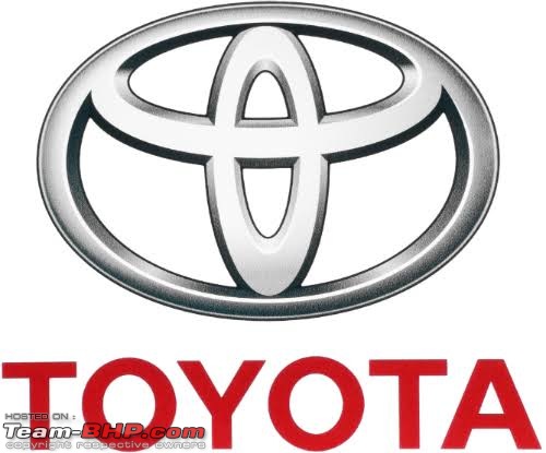
Either the symbol or the words spelled out. It means the same all around the world.
Though, again. If you look at just the emblem for too long, kinda looks generic.
3.
Racing, competitive, passion, performance 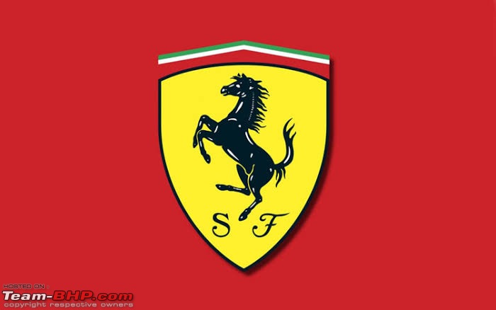
Maybe add finesse, thoroughbred, snob also.
Heavily merchandised too, but it passes the
long hard look test. Squint hard, look hard for a long time. Look away. Them look again. Still got that unique look. Like the word 'ice'. Never gets weird with repetition. Maybe it's the loud colours at work.
Only one for me ,
Maserati. 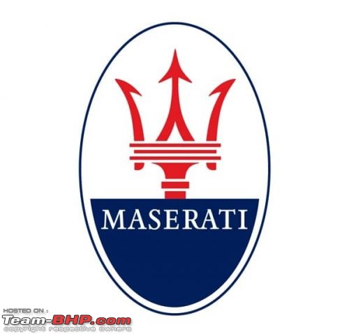
Especially the
Trident. 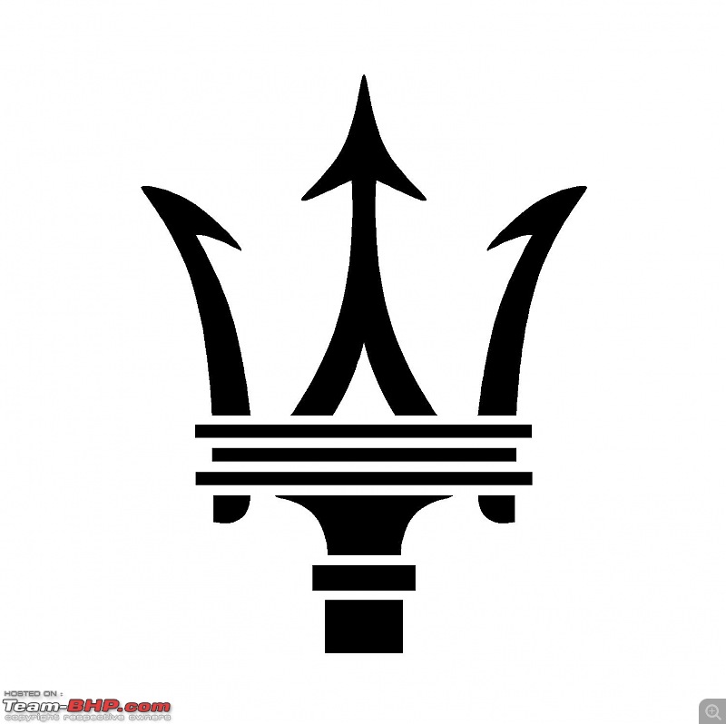
Just for some extra information:
Quote:
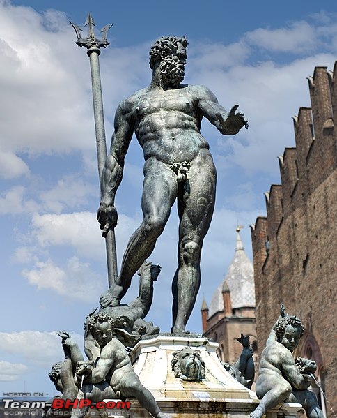
The trident logo of the Maserati car company, designed by Mario Maserati, is based on the Fountain of Neptune in Bologna's Piazza Maggiore. In 1920, one of the Maserati brothers used this symbol in the logo at the suggestion of family friend Marquis Diego de Sterlich. It was considered particularly appropriate for the sports car company due to the fact that Neptune represents strength and vigour; additionally the statue is a characteristic symbol of the company's original home city.
|
That driving P in Punto is cute and well designed. It is not a logo but well thought badge rather.
| All times are GMT +5.5. The time now is 20:07. | |