Team-BHP
(
https://www.team-bhp.com/forum/)
-
Motorbikes
(
https://www.team-bhp.com/forum/motorbikes/)
Why has REM gone more retro with these new fonts?
The colors that have come out are good, especially makes the Classic series look more classic in a nice way.
The font on the other hand is a waste of time and resource. Instead they could have worked on so many others aspects and bettering existing parts on their bikes.
Quote:
Originally Posted by ku69rd
(Post 3433802)
Mate,
Check out if you can lay your hands on the Battle Green, it is simply too good. Just came off the showroom and must admit it is fantastic. The new logos take the sheen off it though :Frustrati
|
The Battle Green is my personal favourite too, but it doesn't come on the Classic 350.
It is only available on the CL500 variant, which leaves me with Black, Silver, Lagoon & Ash.
Ash being a different colour not introduced by RE earlier stands out in my opinion.
I hope it's not a plain white shade, which makes the Classic look like a Traffic Cop Bike. :p
Hi Guys,
Have a question. Is the battle green color available for Indian customers now? I thought it was only for export market.
I really wish RE comes me out with Classic Chrome, Desert Storm and Battle Green colours in CL350 as well as I feel this is the only model from RE which sells in good numbers.
Vijay
The Battle Green makes me wanna go for the CL500 instead of the 350.
It truly is amazing & gives the bike the 'Royal' look IMO.
I was wondering, is it available for sale in India ? Can one really get the battle green colour registered on the registration certificate, because I remember there are some restrictions on it due to the Army using the It on their vehicles.
The thunderbird looks better than before.Am I right about this.?
But they badly messed up the logo:Frustrati
IMO, the new color tweaks are probably acceptable by the huge fan base that RE commands over and across our nation but the change of logo is something they shouldn't have come up with. Even if they did, this isn't the output one would expect from the roaring brand!
I feel lucky to have bought my Classic 350 (Classic Black) before this change took place. lol:
It is 4 months old now, done with 2 free services already and gives me a decent mileage of 40kmpl. :D
Attaching a few pics of my "dhak-dhak".
Change is the only constant, I also loved the old one, but ppl will accept this change eventually.
Ideally, RE should have worked on making the machine robust which was of higher priority than re-working on the logo.
I was checking the RE webpage, and the image that is shown for CL350 does not show the mirrors, I hope they have not made that as an accessory !!!...
RE Announced new colors


The same can be viewed on their website.
I thank my stars that I bought my thunderbird 350 last month. I could not have digested the ugly new logo. Would have felt so much of a compromise. I had no idea the new logo was coming.
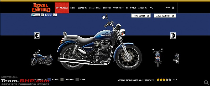
Thankfully they have "Stone" as one of the color options in the Thunderbird 500. If I were to buy a TB, this would be the color of choice.
When it comes to the Bullet 500 which is the other model which I have shortlisted for purchase, my choice of color would be Black.
Ever since the new logos have come out, have seen the new logos a number of times, it is slowly growing on me and I guess it will be the same with most people.
The only disappointment is the fonts used which make it look After Market rather than OE.
Seriously Why are they even spending money and effort to change something that is not a necessity or even needed. Instead they should have concentrated on improving the bikes.
What is with the curves in the font. Are they trying to attract more women to ride them now???
within 60 days, the old logo will be forgotten by the ones who matter to RE. personally the new logo grew on me and i find it pretty nice. its a modern retro classic.
Quote:
Originally Posted by indian21r
(Post 3435777)
Seriously Why are they even spending money and effort to change something that is not a necessity or even needed. Instead they should have concentrated on improving the bikes.
What is with the curves in the font. Are they trying to attract more women to ride them now???
|
Poor guys want to rope in more customers with some fresh feel and show the world that they are also changing and updating themselves but sad part is no one is liking these updates.
Every change will have a certain opposition but as time progresses people will accept these changes and move ahead. Sales may not get that affected with such changes IMO.
| All times are GMT +5.5. The time now is 04:28. | |