Team-BHP
(
https://www.team-bhp.com/forum/)
Audi has redesigned its iconic four-rings logo. The new Audi logo debuted on the recently unveiled Q8 e-tron.

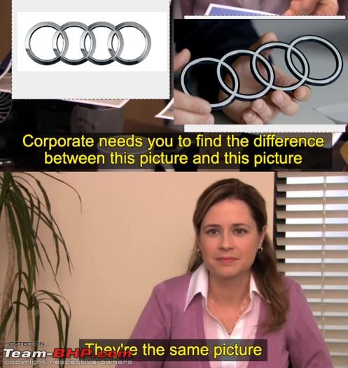
The redesigned rings are a new take on the brand's classic logo. The logo offers a 'modern image' to the brand, featuring a two-tone appearance with a black background contrasting with the white rings. The new logo also has a 2-dimensional appearance, which will be standard across all its variations going forward.
Frederik Kalisch, a strategist, explained that the 2D appearance was a consequence of digitisation. However, Audi wanted to have a 'consistent brand presence across all customer touchpoints and hence went about redesigning the rings for their vehicles as well.

Adding to this, designer Andre Georgi stated that they wanted the new logo to look the same everywhere, whether it be in a magazine, a smartphone, a billboard and on or inside the car. The new logo is almost identical in its geometry but gets a more graphic makeover.
Apart from the logo, future models from the brand will also feature an exclusive font known as 'Audi Type'.
Link to Team-BHP news
I am waiting for someone to quote how much it costed Audi to get this done :uncontrol
Maybe its marketing stuff and maybe my high school Math is a bit off, but is the design itself already not 2 dimensional or in fact 3 dimensional if you account for thickness of the rings?
All that this logo does, is remind me of the dialogue from Andaaz Apna Apna.
"Baal kate bhi hai, aur pata bhi nahi chalta."
P.S. - Apologies to our non Indian readers for the non English message, but simply couldn't resist.
So a solid black plate with 2D white rings on it? The rings are not hollow anymore?
So surprised this had not been posted so far, so went ahead and made it myself.

Am I the only one to see it and wonder “ what’s new in that ? “
I mean why the fuss over making something 2D from 3D. It’s basically the same. Just because a big brand like Audi spent money, got a big shot designer and did this, people are talking about it. Just free PR.
Quote:
Originally Posted by RahulNagaraj
(Post 5439360)
|
If that hands too are part of the Logo, then it's a commendable achievement by the designing team.rl:
I had a friendly banter with a friend who works in the automotive design industry and seems like it is a big deal that many automakers are making their logos such that they will look the same in the physical and digital worlds. The discussion started with the KIA logo.
I don't get confused by an Audi logo on the screen and the one on the car.
I come from design this design industry and can tell you this more marketing than any significant design effort. When one can't see the Z axis it is 2D, and when one can see the Z axis it becomes 3D. There is nothing revolutionary here. I think it is pretty lame to make such a big announcement about it.
Having been part of one such branding excercise, with the lead guy being some New York design school professor who specialized in font design i can guess how this might happened.
Day 0: client: we want something transformative, transcendent, vivid, engaging, reflecting our preferences (were got a view of the entire HQ plus some warehouses and labs)
The first few suggestions were all shot down as being not in line with their current messaging/positioning
This went on for months until by some miracle everyone agreed on one option which was essentially a flat version of the old logo with a grey outline. In my opinion many of the drafts were much better. But then design by committee tends to result in things like this
Rings of smoke. Pretty much blowing a lot of money, smoking a fortune on a branding exercise. Not just a-oooo-di, but most companies that do this.
This rivals the famous thermacol technology we employed to keep water held in dams from evaporating. I am gobsmacked by the enthusiastic approach to the upheaval in the tremendous change of tenor influencing the presumptive nature of change at the management team's elite leading getting channelled into the energy behind this massive change.
P.S. - Typical corporate squeak, means nothing.
| All times are GMT +5.5. The time now is 13:59. | |

