Team-BHP
(
https://www.team-bhp.com/forum/)
We had reported that Mahindra was working on a
new brand logo way back in December 2020. Now, this is how the new logo looks like.
Note: We are not sure if this is the final one and it might receive some changes before release. 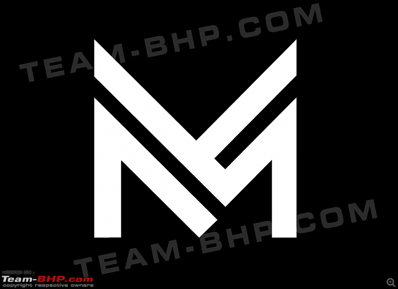
Unlike the current logo, which is an oval with three lines that meet at a point, the new logo is a simple upper case 'M'. However, it is said that this isn't the final version, and it could receive a few tweaks by the time it's launched with the XUV700.
The current logo was adopted in the year 2000 following the reorganisation of the company by the then Managing Director, Anand Mahindra. It first appeared on the Scorpio in 2002.
The XUV700 is likely to be the first model to use the new logo, followed by the next-generation Scorpio.
Thanks to
Siddharth for sending this image in. Heartfelt gratitude for sharing it with other enthusiasts via
this Team-BHP page!
Link to Team-BHP News
My opinion - Sharp and over styled like some of their products.
Looks like a man driving while reclining too much.
Was their inspiration the Punto logo?
Did they take inspiration from old maruti logo ?
Yikes! No please no. I love the current logo and Rise slogan.
I find this confusing and what's really worse, I can't be the only one who sees subtle similarities with one of the most hated logos from the last century. From the angle of the tilt to the closely placed parallel lines.
Please change this if you're reading this M&M
Looks more like a logo of some clothing brand. Definitely a big no from me:coldsweat
Don't think this will look good on cars.
Wow, I don't know how I feel about this. This looks like it belongs to a web browser or something a startup brand would do. Or I guess I'm someone who doesn't like drastic changes.
After seeing this only one word - "CAR TOON ISH" !!
Looks like transformers
It so takes away the oval m association from Mahindra.
Oh god,this logo reminds me too much of that Nazi Emblem:confused:
On a serious note,this logo might be suitable for sporty EV's.But butch SUV's,HELL NO.
It has got to be something that symbolises rough and tough,something the present logo is XUcuting(lame?) quite brilliantly
Somehow not able to accept this one. This looks too immature, made in a jiffy. The current logo is good, even the previous one was better than this.
Dear Mods, can we have a poll on this one?
I'm not a fan of the current logo, but this just does not fit an automobile company and not something I want to see on cars.
This logo would be more suited on a fashion brand or a Hotel or something, not a car.
Logos, names, fonts, the color and size are well researched before being adopted. The combination gives out a certain energy which can impact the fortunes of the company.
Somehow, I am not convinced with this new logo. I too am not fan of their current logo. But this new one is pretty bad. Let's see how it goes.
As many pointed out it reminds me of old Maruti logo, looks like Mahindra is serious about a turn around. It will be available with XUV700 right ?
YUCK!!! :Shockked:
This is what they come up with? Maybe they didn't have to look far. Took inspiration from Maruti and Isuzu emblems.:Frustrati I guess.
Though I still can't get over the new fabled 2D flat symbols/emblems instead of 3D deep ones.
On second thoughts, this may look good, with the pointed M looking sinister and brooding like Batman. Or inspired from the design philosophy starting from the XUV300. But can't unsee what @Avinash_R said. Looks like the recliners in old international airports.
This looks more like the original Maruti logo!!
| All times are GMT +5.5. The time now is 09:20. | |