Team-BHP
(
https://www.team-bhp.com/forum/)
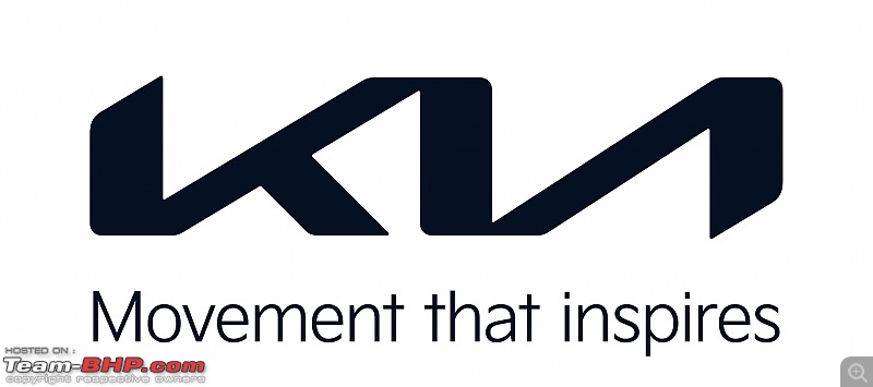
Kia Motors India has now been renamed as Kia India. The company has also announced the launch of its new logo and brand slogan - 'Movement that inspires'.

Kia's new logo resembles a handwritten signature and replaces the old roundel. India is the first country after South Korea where the brand relaunch has taken place. The Seltos and Sonet will be the first products to get the new logo. Both cars will get new features and will be launched in the first week of May 2021.
Kia has emerged as the fourth best-selling car brand and the fastest carmaker to achieve 2,50,000 sales in the country. According to the company, 60% of its sales come from top variants of the Seltos, Carnival and Sonet.
Kia plans to expand its dealer network to 360 touchpoints, covering 218 cities including Tier-3 and Tier-4 towns by the end of this year.
Thank goodness they got rid of the, frankly, cringeworthy "Badass by design" tagline.
That tagline would have worked with ripped jeans targeted at 19 year olds, not with million rupee SUVs.
Agree with turbo above on the tagline. "Badass by design" didn't go well with the brand.
Regarding the new logo, the triangle between the 'k' and 'i' looks like an arrow pointing left, or moving backwards. How did it slip past the logo designers and the brand experts?
Quote:
Originally Posted by turbo
(Post 5052142)
Thank goodness they got rid of the, frankly, cringeworthy "Badass by design" tagline.
That tagline would have worked with ripped jeans targeted at 19 year olds, not with million rupee SUVs.
|
Quote:
Originally Posted by sramanat
(Post 5052163)
Agree with turbo above on the tagline. "Badass by design" didn't go well with the brand.
Regarding the new logo, the triangle between the 'k' and 'i' looks like an arrow pointing left, or moving backwards. How did it slip past the logo designers and the brand experts?
|
Well the badass by design is for seltos and that is here to stay! Carnival is extravagant by design and sonet is wild by design!
I feel a bit disappointed with the new logo. I would say that the design language of Seltos, Sonet, Carnival is better than the logo. Slogan says "movement that inspires". When I see the logo, I cannot connect it that well with the slogan. The way KIA letters font and design is done, while reading from left to right, it appears to have gradual rising slopes with a sharp downturns ending with letter A. Expected a somewhat better logo design from them.
I much prefer Kia's old logo, badge and treatment (black with a chrome border). It was a lot more "badass". The new one is too clean, too simple and too confusing (could also be read as KVI).


Quote:
Originally Posted by TusharK
(Post 5052112)
'Movement that inspires'.
|
This is fine. Every car manufacturer now wants to become a "mobility" company, so movement as a term is suitable. Hyundai now refers to itself as "Indias first smart mobility solutions provider".
Quote:
Originally Posted by turbo
(Post 5052142)
Thank goodness they got rid of the, frankly, cringeworthy "Badass by design" tagline.
That tagline would have worked with ripped jeans targeted at 19 year olds, not with million rupee SUVs.
|
rl: rl:. Well put. Although I think it was a great idea at launch. Reflected the aggression of the company too. But yes, the product is now well accepted and it's time to move on from
badass by design.
Is it me or anyone else think this new logo looks like someone crashed into the car and paint got chipped off at that location :p Should have retained their old logo, clean, bold and readable !
The old logo on the bonnet and keys were nice and prominent. Also the name of the Company was clearly spelt in the logo itself, which is not the case with most companies. However, the new one is here to stay for sometime. We as a market have accepted KIA motors. Hence lets accept the new logo as well.
I must say I really like the new logo. It has a futuristic vibe to it. Moreover, this logo will age much nicer as newer cars are designed keeping the logo placement in mind. But till then it's going to stick out in either a good or bad way.
The new logo is confusing and odd. Had got used to the old one, even if it looked outdated, it was clean. They should have retained the black oval shape. This looks like K-backwards N as told in this funny review of the 2021 carnival
 https://youtu.be/Fn_htHFC4cw?t=313
At first glance it reads KVI (rather than KIA). The old one frankly looked much nicer as an automobile maker’s logo.
The new one would be okay for a tech firm, perhaps.
This new logo isnt even clearly visible on white cars.
On top end variants the chrome makes it difficult to see the logo.
I would personally go with old logo any day.
Is the logo white in colour? It looks like someone has made this with 6 strips of masking tape! Don't like the placement at all. At least they should have where the original badge was.
| All times are GMT +5.5. The time now is 20:17. | |