| First look at Android 12 UI
As an iOS user, I see a lot of new things in this version of Android. While not all may make it to the final version, I'm happy to see the direction of the change. Colour palette is sobre and the font and app icons looks neat too.
UI is still an unknown till someone gets their hands on it, but widgets and the privacy changes look promising. Quote:
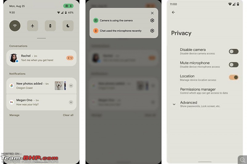
The document contains details and screenshots showing new UI and privacy features. Folks over at XDA Developers claim that they’ve seen evidence to suggest that the document is real even though they don’t fully commit to the authenticity of the screenshots.
Nevertheless, one of the screenshots of Android 12’s alleged UI shows tweaks in the notifications panel. It’s no longer transparent but has a light beige backdrop. The color could depend on the current theme of the phone or the dark/light modes. It’s believed that Android 12 will bring a whole new theming system on board that’ll not only color the UI but also apps on your Android devices.
Besides the background change, notifications in the panel now have more rounded corners. The number of Quick Settings displayed in the menu seem to have reduced from eight to six, bearing larger icons. The clock and date have also swapped positions.
| Source    |  (9)
Thanks

 (9)
Thanks
